
Chosen Logo

Logo Concept Exploration


The Brief
The brand is named for a flower known for standing tall in a field of grass. The client wanted the brand to use a traditionally feminine color palette, but otherwise feel strong and bold.
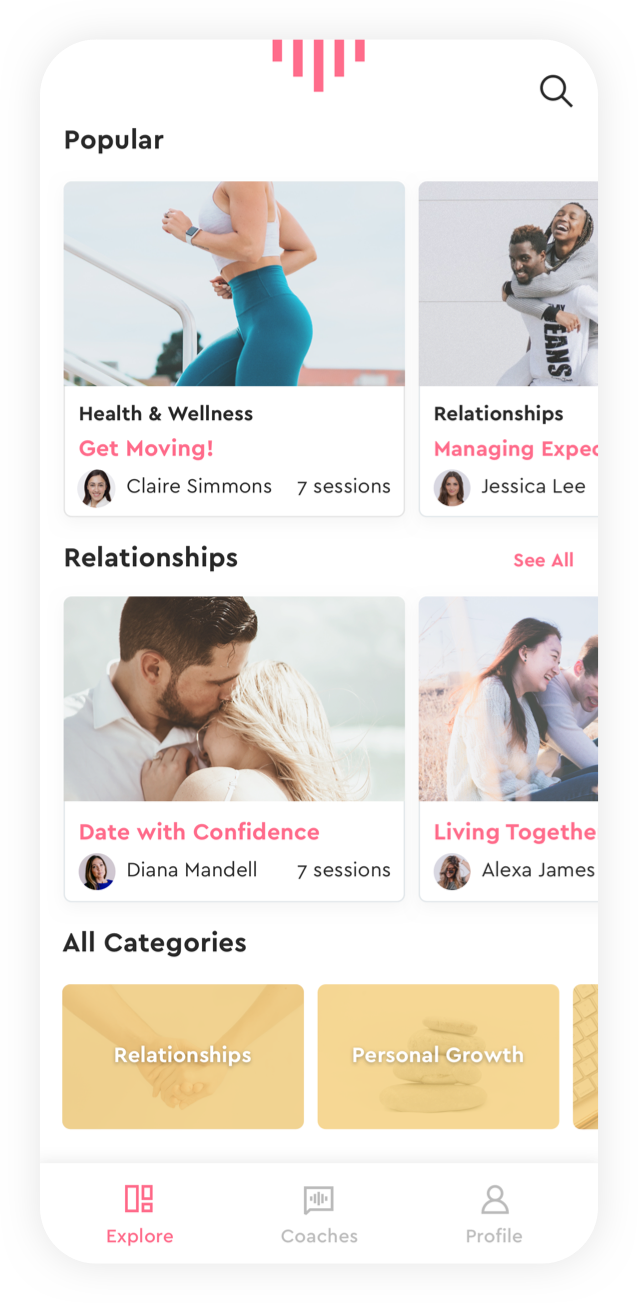
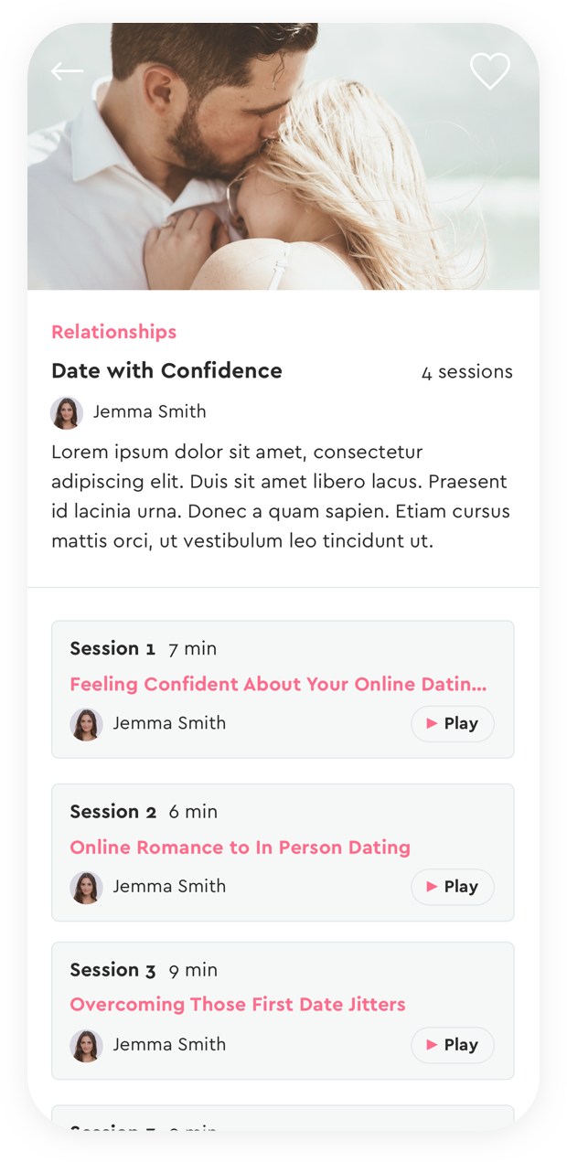
We designed the app to feel clean and modern. They felt like a lot of competitors feel overly feminine and flourished, but Marigold aimed to be more clean and elegant. The soundwaves became an iconic piece to the brand and are used and animated throughout the app experience to bring movement and life to the app. We also established an extended color palette and some guidelines for posting on social media.
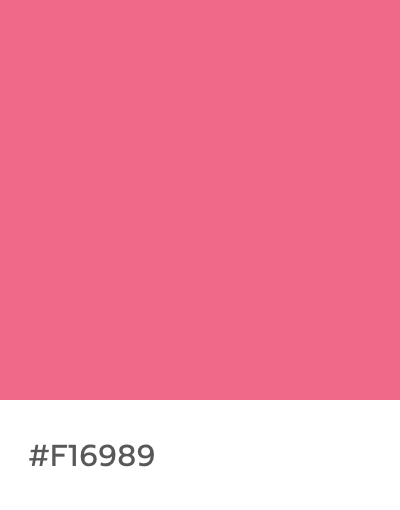


Brand Color Palette

Social Media Aesthetic
