Design tips (for non-designers)
Some simple tips and tricks to making *everything* look great
Designer or not, we all know that a little design can go a long way. Knowing a few simple tips can keep your internal documents, presentations, emails and everything in between feeling professional and polished without a ton of effort (or having to nag your designer for small tasks) is easier than you might think, just keep these simple rules in mind.
Consistent margins and spacing
Crowding the edges of a document can make it feel cluttered and poorly planned. Putting objects or text too close to the edge of anything creates a visual tension that is usually undesirable and distracting. By simply minding the margin of pages and giving elements a little breathing room from each other, you can make it a little easier on the viewer’s eyes.
When you’re setting spacing between elements or paragraphs, just use the same margins between all elements. This makes things feel consistent and thoughtful.

Put a little thought into long-form text
If using long form text, adding ample line spacing helps users read clearly. I prefer the rule of 1.5 x [font-size] = ideal line spacing for your long form text. I find people tend to use default line spacing, and depending on the tool, that's often too tight.
And on the note of the previous tip, give your body copy some extra margin on the sides; it’s really hard to read text with a really wide line length instead of shorter widths of text. You'll notice you tend to lose your spot in the text when lines are too long. Doing your best to make long text legible increases the chances your audience will actually read your content. The optimal line length for your body text is 50-70 characters per line, including spaces. Use a simple tool online to calculate this for one line and adjust the doc accordingly.
And even if the document feels longer with more narrow lines of text and extra line spacing, the results and retention are your goals.

Use a limited number of fonts
Use only a couple fonts in any document. I recommend for most things, just use one, but use a couple weights and sizes for distinction. Maybe you’ll have one font for titles and subheadings and another for body copy, but using too many fonts can feel amateur and distracting.
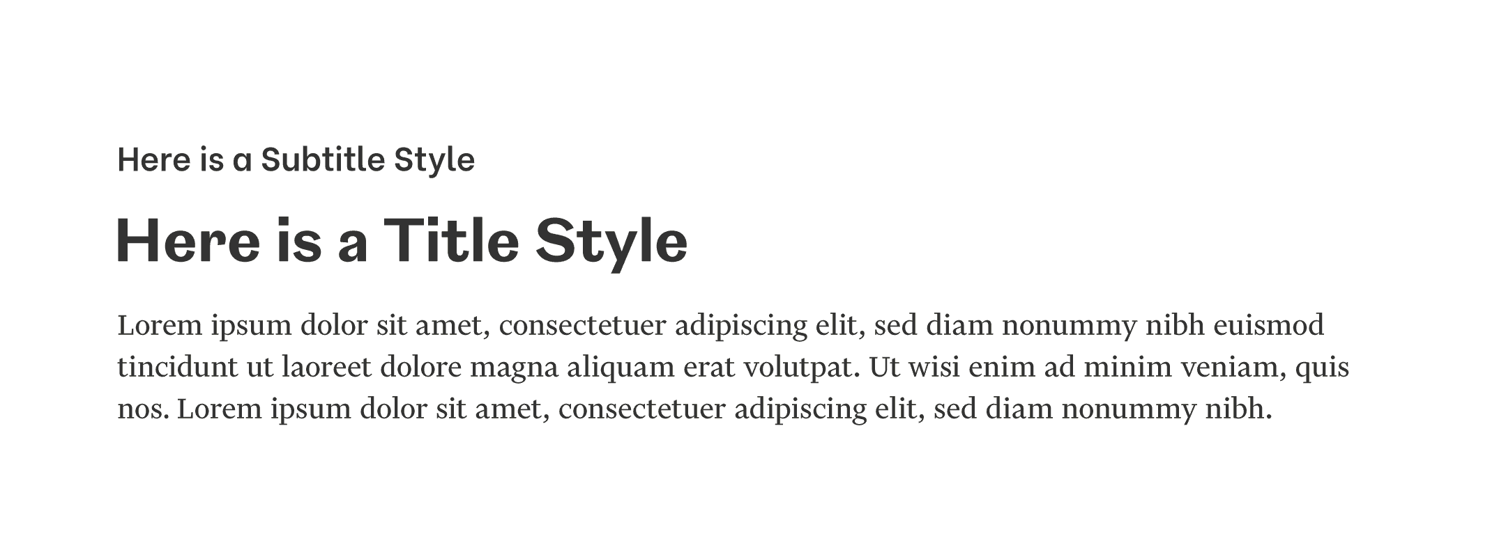
Keep hierarchy in mind
This is simple, but easy to forget. Simply make sure the most important things look like the most important things on your document.
Plan your longer form text or documents in a way that they could be easily translated into an outlined document with titles, subtitles and bullet points. Presentations as well. Can someone scan through your document and get the gist by just reading the headers and subheaders? (Because that's what they'll do.) And this is also great practice for web copy and building your content this way is really accessible on the web.
Contrast in everything
If you’re using multiple fonts, make sure they look quite different. If you’re using different colors, make sure they look quite different. If you’re using different font sizes, make sure they look like different sizes. You get the point. If your design elements are hard to differentiate or too close in size or color, it becomes visually confusing and looks more like a mistake than hierarchy or an intentional design decision.
If you don't think you're good at complementary fonts or colors, just Google something like 'complementary system fonts' and find some suggested lists to base your choices from.
Also note the colors contrast on a background color, especially type. If you're not sure if the legibility is good enough, use a simple online contrast accessibility checker.
Shapes you choose set a tone
Generally, round shapes feel friendly and welcoming. Sharp or pointed shapes can feel abrupt, sleek or bold. Natural, organic flowing shapes feel… well, just that. Placing two sharp shapes near each other creates a visual tension that you should be aware of; if that’s not the intention, then avoid it. But if that matches your content or goal, use it as a tool.
A good guideline to use is to look at your logo. Is your logo and any brand elements established more square or rounded? Use that as a queue for any brand elements you're introducing even in your minor documents.
This comes in handy creating things like presentations and adding default shapes. Or if you're setting up a landing page and wondering whether to use a square or rounded button. This one intentional choice will set a tone.
Simplicity is your friend
Following the above rules and keeping your design simple is always going to feel more thoughtful.
So before you add a color to your text document, ask yourself why? Is it necessary? Does it add to the contrast, legibility or hierarchy? If those are goals of your documents, be sure any design decisions you make support those goals. Don’t just add things to ‘make it interesting’ or 'add color'.
My suggestion? If you don’t have a good reason to add complexity, don’t do it.
Did you find these tips useful? Email me at hello@linseypeterson.com with thoughts or questions, or ideas about branding you want to hear more about.